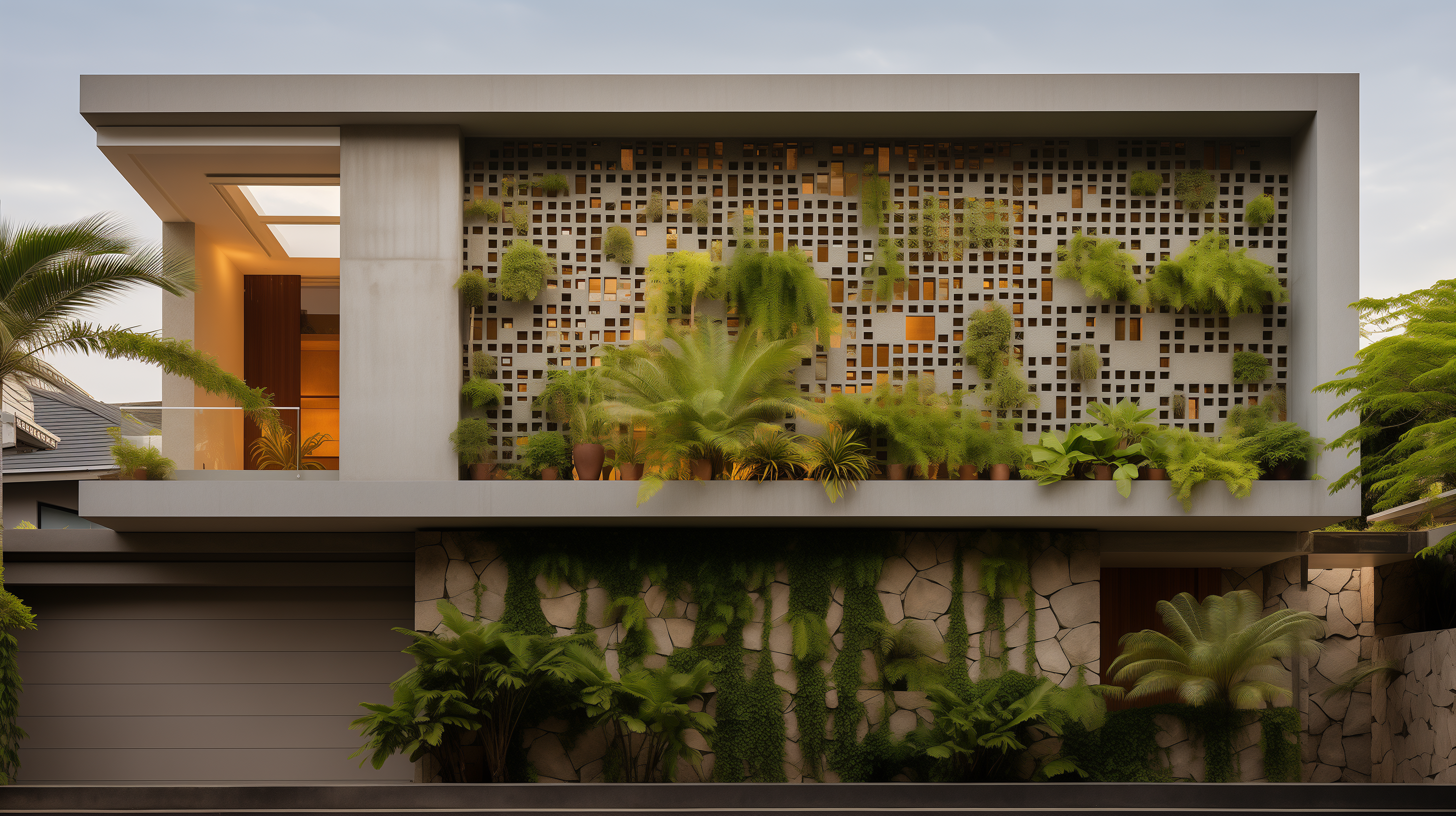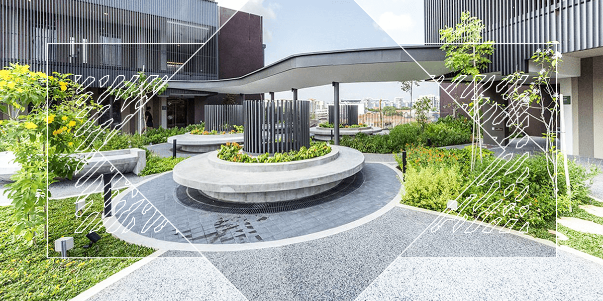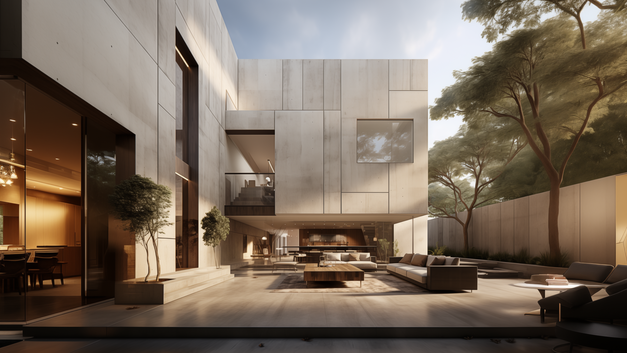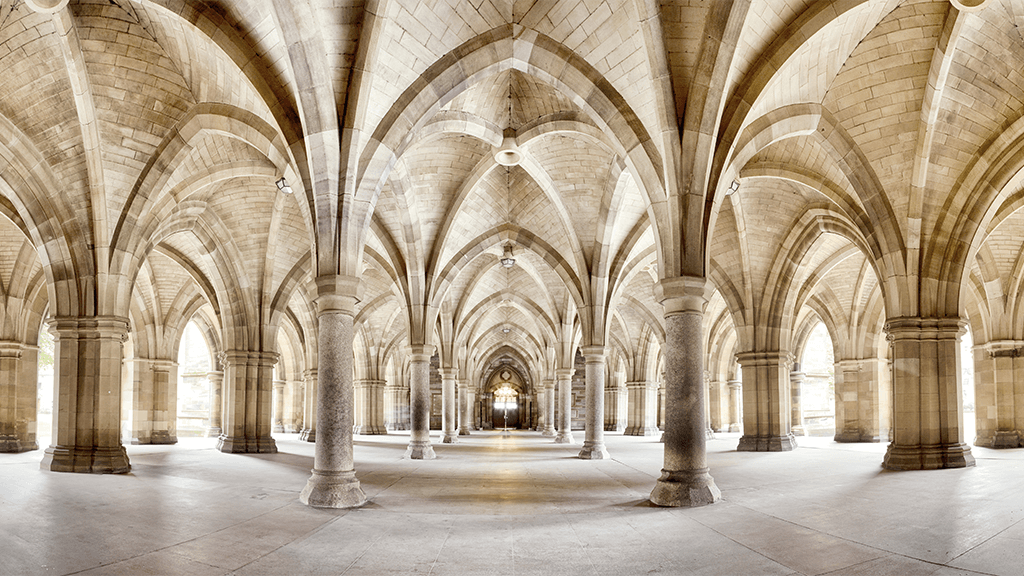
Symmetry means there's harmony in something's dimensions, proportions and arrangement. It provides a sense of harmony and balance. It is portrayed through the distribution of building components and within the spaces between each element.
An axis or central line is usually created, then patterns and replicas are created on either side. Depending on the time period, the cultural influences and inspirations of the architects will determine what type of symmetry and patterns we will find.
The concept of symmetry is pushed from the actual building placements to its very components and decorations. Designs in roofing and even borders will reflect translational symmetry examples.
The Three Main Viewpoints of Symmetry
There are three main areas where we can define the meaning of symmetry. We find it in the simplicity of mathematics, the creation of nature and in the beauty of art and music.
Mathematics
Symmetry comes through to mathematics in a variety of ways. We can see it through any geometric transformation. It is also the type of invariance, a property in which a mathematical object remains unchanged. We can see it in the spatial relationship, mappings of objects and even in calculus.
Nature
Nature has a reputation for symmetry. We only have to look at a pinecone, the leaf pattern of a succulent or the balance in a butterflies wings to see how nature has incorporated it into the design. The world is full of examples where the concept of symmetry has been pushed to the limits.
Looking closely at a snowflake's intricate design, we can see the balanced harmony. Even in the world as a whole, with the ice caps at the top and then reelected at the bottom.
Art and Music
The world around us often inspires artwork, so it would naturally then have symmetry. Consider the 'Last Supper' of Leonardo da Vinci. People's composition might differ on either side of the table, but symmetry exists. The amount of people is balanced, the use of color is balanced and the background reflects either side. Even the arches of the table legs displays the same on either side.
In music, we can hear it come through on a symmetric scale. The symmetric scales equally divide the octave creating a balanced harmony. In the early 20th century, musician Joseph Schillinger designed the Schillinger System, which is based on the idea that music is a form of movement and, therefore can be symmetrical.
Symmetry Is the Direct Opposite of Asymmetry
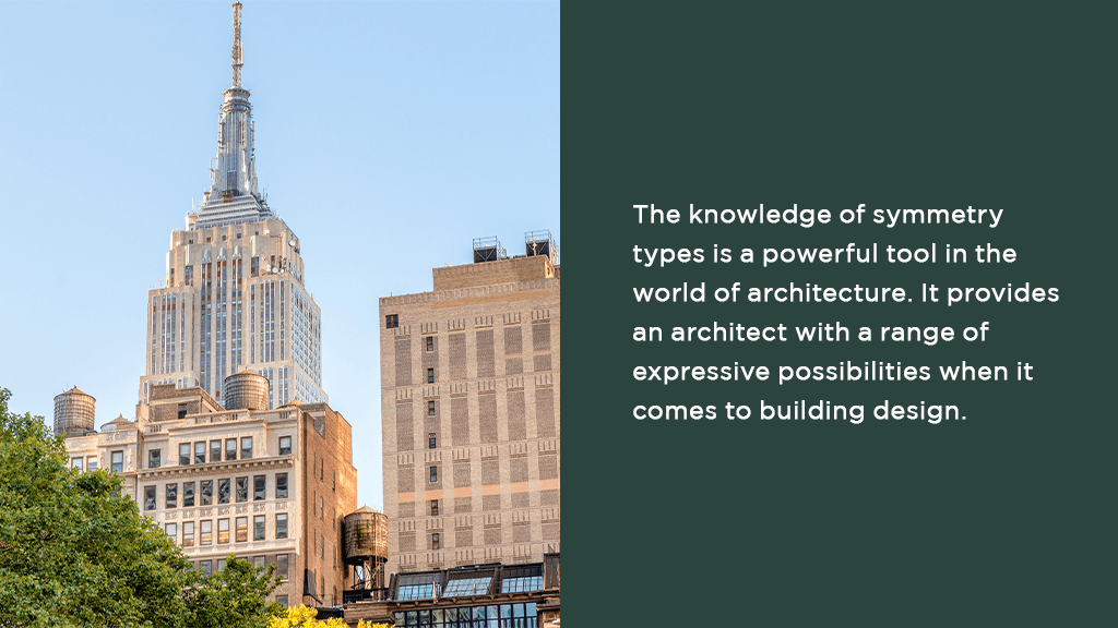
Symmetry seeps into every facet of architecture. It is present everywhere, from ancient landmarks such as the Pantheon in Rome and New York City's Empire State Building, through the blueprints of individual floor plans and right up to the design of specific building elements like the tile mosaics.
Examples of the extensive use of symmetry can be seen in the structure and ornamentation of Islamic buildings like the Taj Mahal and the Lotfollah mosque. Moorish buildings such as the Alhambra are embellished with intricate patterns weaved from translational and reflection symmetries and rotations.
The Types of Symmetry in Architecture
As with any compositional art, architecture relies heavily on symmetry. Symmetrically positioned architectural compositions transcend cultures and time periods. There are countless forms of symmetry, many different types of architecture and a myriad of ways to view the design.
Consider a building for a moment from the street. Imagine an axis going from top to bottom. Therefore the symmetry would represent itself on the left and right of the building. But now imagine if the viewpoint were above the building, looking down. Visualize that line again. Symmetry now shows itself on the layout between the left and right.
If there is a horizontal line, there also could be a vertical one. There is the possibility to either work with the vertical planes or the horizontal ones. Some buildings work with both.
But we can take this one step further if the view is lifted higher so that it is not only the singular building to look at but the entire property. Now we see the symmetry within the layout of the components of the building, as well as the relationship between the other buildings and the landscape.
Of course, there is not only horizontal and vertical axis but also diagonal ones. This refers to Radial Symmetry. Often Radial Symmetry pushes the boundaries as instead of looking at a box shape and dividing it up, it works with a circle. A good example would be a cake with equal slices. Visualizations of this type can be seen in the stained glass rose windows of churches and cathedrals.
Solid and Void
Distinguishing the various forms of symmetry in a two-dimensional composition is relatively straightforward. Identifying symmetry types in a three-dimensional object is much trickier since we tend to change our perception of the object as we move around it. This goes to show that architecture provides us with an opportunity to experience symmetry as we see it. This is made possible through two distinct architectural components – solid and void.
The substantial part of architecture is one with which the layperson is most familiar. For example, most structures are categorized by the nature of its elements. We can identify a Greek temple by its portico and pediments, while pointed arches and flying buttresses characterize a Gothic cathedral. These details thus contribute to the solid component of the architecture.
Likewise, these solid elements constitute an envelope around what we experience when we navigate a building and is known as the void. It is the work of an architect to shape this void such that it becomes the theatre of all actions inside the building. Here, symmetry exists in the form of experience within an architectural space.
Bilateral Symmetry
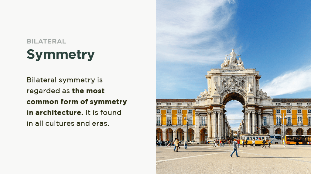
Bilateral symmetry is regarded as the most common form of symmetry in architecture. It is found in all cultures and eras. With bilateral symmetry, the composition is a mirror image of one another. A famous example of bilateral symmetry can be found in the façade of the Pantheon in Rome. The exact symmetry is also present on an urban scale, as evident in the design of the Praça do Comércio located in Lisbon, Portugal.
The structure has three urban elements wherein symmetry is visible through a long horizontal axis governing our visual perspective. They are a principal public square, a monumental gate and a wide commercial street beyond the gate. The popularity of bilateral symmetry is likely credited to the fact that it reflects our experiences with nature, more importantly, what we experience with our bodies.
Since many cultures believe that God created man as an image of himself, architecture has similarly created an image of man. However, not all bilateral symmetry is equally valued in architecture, as dualism in architecture is traditionally avoided.
Ancient Greek Examples
The temples of ancient Greece, for one, were always built with an even number of columns so that a column on the central axis of the façade would not need to exist. The avoidance of dualism by classical architects has its roots in ambiguity, often associated with the number two, from the time of Pythagoras.
The latter was regarded as a female number that could be divided into two thus rendering it an untrustworthy number. On the contrary, the number three was a male number, which could not be equally divided into halves.
Orsanmichele in Florence
The modern architectural theory also considers dualism to be a "classical and elementary blunder" linked to the "amorphous or ambiguous". Despite that, the argument against dualism does hold weight in architecture. This is exhibited in the 14th-century Orsanmichele in Florence. The monument has an oratory on the ground floor and a granary on the second. The oratory has an unusual two-aisled plan consisting of two altars.
This poses a dilemma to individuals as one is forced to decide on which altar to stand in front of. The architect typically makes this decision for the audience by placing one altar in the center. Hence dualism in architecture remains a struggle for both the audience and the architect.
Rotation and Reflection
Rotation and reflection is another style of symmetry. It contributes to the movement and rhythm of architectural elements and emphasizes the central point of the architectural space.
The Basilica di Santo Spirito in Florence, Italy, is designed to have an octagonal shape while both the architecture and pavement is distinctively designed to be rotational and reflectional. Most domes including the hemispherical-shaped rotunda found in the Pantheon and the octagonal cupola of the Florence Cathedral also manifest rotational and reflection.
Cylindrical Symmetry
Cylindrical symmetry, when found vertically in towers and columns, evokes a sense of resistance toward gravity. There are rare examples of spherical symmetry in architecture as it is challenging for architects to implement it in their designs. This is because we move about on a horizontal plane. This form of symmetry can be gleaned in the cenotaph designed by Etienne-Louis Boulée for Isaac Newton in 1784.
Chiral symmetry might not be as popular as other types of symmetry although it is often used effectively in architecture. Chiral symmetry is when two objects mirror each other without being superimposed. For example, the two opposing colonnades surrounding the elliptical piazza in front of St. Peter's exhibit chiral symmetry.
A more subtle form of chiral symmetry evinces itself in the two leaning towers of the Puerta de Europa or Gate of Europe in Madrid, designed by architect Burgee in collaboration with Philip Johnson. Chiral symmetry can be used to place visual emphasis on the significant elements of a composition. In this case, the two inclined towers of the Puerta de Europa are used to draw attention to the broad boulevard that passes through them, constructing a "gateway to Europe" as per its title.
Similarity Symmetry
Fractals influence similarity symmetry. It is found when repeated elements change in scale without changing shape. An example of similarity symmetry is seen in the nestled shells of the Sydney Opera House, designed by Joern Utzon in 1959. The shells differ in size and inclination to form a sphere segment, although the shell shape remains unchanged.
Similarity symmetry can also be applied in less obvious situations. American architect Frank Lloyd Wright borrowed this method when designing the Palmer House in Ann Arbor, Michigan, during the early 1950s.
Here, Wright selected an equilateral triangle as a planning module before duplicating many levels and sizes to organize the design of the house. This shows that similarity symmetry can create a high degree of order within an architectural model regardless of how visually apparent they are by lending unity to a composition.
Spiral Symmetry
Spiral or helical symmetry can be categorized as a unique form of similarity symmetry. Helixes and spirals often communicate continuity in architecture. This is manifested in spiral staircases whereby the entire form denotes a sense of flow in the space from one level to another throughout the building. Frank Lloyd Wright incorporated the helix into his 1946 Guggenheim Museum of New York design.
The exterior of the building takes on the form of the giant helical ramp found in the interior. The gallery spaces are situated along one side of the ramp. Museum visitors will take the elevator to the gallery's top floor and then descend to the ground level in a spiral-like manner, admiring the displayed art along the way. This piece of architecture has undoubtedly expressed spatial continuity through the use of a helical ramp.
Translational Symmetry
Translational symmetry is the second most common type of symmetry after bilateral symmetry. Translational elements arranged in one direction are either placed within the rows of soldier-like columns or sequentially in the arches of an aqueduct. Translation of elements in two directions can be found in the wallpaper-like patterns on the curtain wall façade of many present-day structures.
Translational symmetry can also include duplicating entire pieces of modern buildings although people lament that this style is boring or monotonous. There are three excellent qualities exclusive to translational symmetry architectures:
- the longest,
- the broadest
- and the tallest.
The knowledge of symmetry types is a powerful tool in the world of architecture. It provides an architect with a range of expressive possibilities when it comes to building design. However, there is another aspect of symmetry covered in architecture. This is the void that is the architectural space and is the aspect of symmetry that we do not see.
The Two Key Concepts
Architectural space can be understood as two key concepts – center and path. The center is related to a single valuable space within the larger architectural area. An example of this would be a church altar. Path, on the other hand, is tied to the spectator's movement through the space.
According to Norwegian architectural theorists, every church has a center and path although this relationship can differ. This relationship affects how we view an architectural space at any given time. In symmetrical terms, the center can be considered the point and the path, an axis.
Roman Architecture's Axial Symmetry
Roman architecture is characterized by a strict axial symmetry that gives rise to spaces that are monumental and static. They embody a sense of equilibrium over the feeling of dynamic movement.
This is evident in the symmetrical relations of the Roman basilica, a secular building type used as a court of law. The structure is of a rectangular shape, with an apse present on each end of the primary axis and doorways located on each end of the major axis. Architectural elements are positioned such that similar elements always appear opposite from one another – apse to apse, column to column and doorway to doorway.
A sense of balance and equilibrium in the architecture is further perceptible through the remains of the pavements used in basilicas. They are frequently based on patterns typical with translational symmetry in two directions, rather than a dynamic symmetry type like rotation.
The same static arrangement of architectural elements is mirrored in the rotunda of the Pantheon. The plan in here is a circle, eight reflection planes as well as one four-fold axis of rotation. Symmetry is once again found with the apse-to-apse, aedicule to aedicule, niche to niche and column to column setting of the rotunda. The strict axial symmetry in this scenario solidifies Roman architecture's characteristic as one with a sense of equilibrium.
Christianities Bilaterally Symmetry Architecture
The legalization of Christianity in the fourth century, however, led to Christian architects rearranging the Roman basilica to meet their own ecclesiastical needs. They removed the entrances from the minor axis and replaced them with a single door on one end of the primary axis.
They also placed an altar in the remaining apse. Hence the symmetry of the Roman basilica was significantly altered such that only a single reflection plane and no rotational planes were left. This was, however, in line with the bilaterally symmetrical plan of the Christian basilica.
Human beings are equipped with a highly sensitive perception of symmetry. We can detect the aspects of symmetry and quickly discern them in symmetrical forms. Above all, symmetrical patterns showcase the perceptual value of the symmetrical axis.
Symmetry is a visual aesthetic that can be replicated in the architectural design, as noted above, all the way through to the hardscape design. Chat with our team at Jonite to see your vision come to life.

